Pipeline Report HTML
File: [sample_name]_Pipeline_Report.html
A pipeline report HTML file is generated and contains the results from the sequencing analysis pipeline. The pipeline report is a stand-alone HTML file that requires no internet connection making it easy to share with collaborators. The pipeline report contains several graphs to help visualize the results. There are also helpful tooltips that describe each specific metric in more detail. The pipeline report also contains the pipeline inputs that were specified for the sequencing analysis, allowing you to reproduce the analysis using the same inputs and settings.
Summary section
The pipeline report starts out with the summary information at the top with the most important metric results. The number of putative cells is shown at the very top. Underneath the putative cells is a summary table for all bioproducts that were included. On the left side of the bioproducts summary, some key library specific metrics such as the number of reads in the FASTQ, the percentage of reads that passed all the quality filters, and the percentage of reads that had a valid cell label and UMI that aligned uniquely are shown. On the right side of the bioproducts summary, some key bioproduct type metrics such as the number of reads that passed all quality filters that aligned, the average number of reads representing the molcules detected in each cell, and the average number of molecules detected per cell label are highlighted. If ATAC-Seq data was included in the analysis, a summary table for ATAC-Seq metrics will be shown next. Similarly to the bioproduct summary table, the left side of the ATAC-Seq summary will show some key ATAC-Seq library specific metrics. On the right side of the ATAC-Seq summary, some key ATAC-Seq metrics are highlighted.
Graph section
The graph section has several interactive graphs highlighting some of the most important results from the analysis.
For pipeline runs that identify more than 100,000 putative cells, tSNE dimensionality reduction will be skipped, and if more than 300,000 cells are found, the UMAP graph will show a random sub-sample of 300,000 cells.
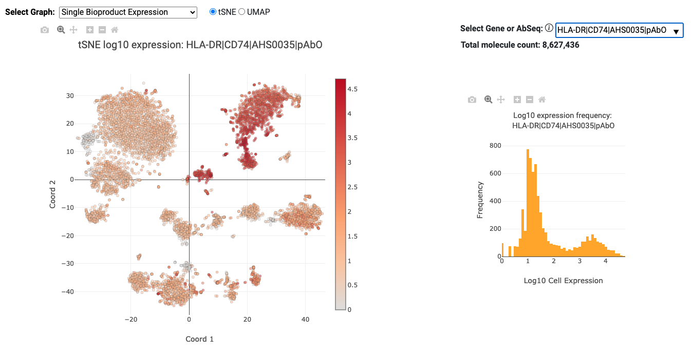
Single Bioproduct Expression (mRNA and AbSeq)
The Single Bioproduct Expression graph displays a tSNE/UMAP on the left and a histogram on the right for individual bioproducts. Each dot on the tSNE/UMAP represents a putative cell and is colored by the log 10 expression of the selected AbSeq target or mRNA gene. The histogram shows the distribution of expression for all cells for the selected AbSeq target or mRNA gene. By default, the bioproduct with the highest expression is selected in the dropdown list. The AbSeq targets and mRNA genes are sorted by total expression (highest to lowest) separately. The sorted AbSeq targets are shown first in the dropdown list followed by the sorted mRNA genes. For experiments with many bioproducts, only the most highly, widely, and variably expressed genes plus all AbSeq targets are shown.
Immune Cell Type Experimental (mRNA, AbSeq, and ATAC-Seq)
The Immune Cell Type Experimental graph shows the tSNE/UMAP plot with each cell labeled according to the results from the Cell Type prediction algorithm.
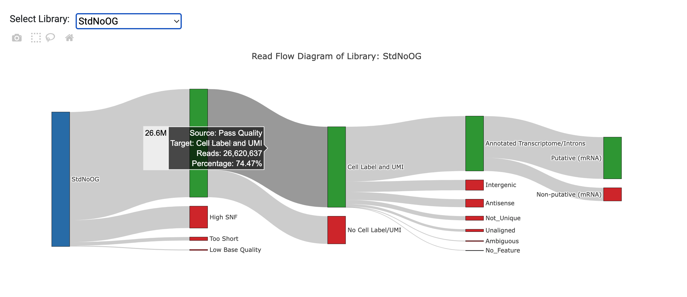
Read Flow Diagram
The Read Flow Diagram displays an interactive visualization of how reads are being filtered at various steps of the pipeline. A plot is generated for each library. If more than one library exists under the same library category (i.e. ATAC or Bioproducts), then a combined stats plot will also be generated. Hovering the mouse on nodes or flows will show a tooltip with detailed statistics (read counts, percentage). The putative cell step is only available in the combined plots, since all reads for a library category are combined at that point.
Total Molecules per cell (mRNA and AbSeq)
The Total Molecules per cell mRNA and AbSeq graphs show the tSNE/UMAP plot on the left where each cell is colored by the log 10 of total expression for all mRNA genes or AbSeq targets respectively. The histogram on the right shows the distribution of total expression for all cells for all mRNA genes or AbSeq targets respectively.
Total Transposase Sites in Peaks per cell (ATAC-Seq)
The Total Transposase Sites in Peaks per cell ATAC-Seq graph shows the tSNE/UMAP plot on the left where each cell is colored by the log 10 of total transposase sites in peaks. The histogram on the right shows the distribution of total transposase sites in peaks for all cells.
VDJ BCR/TCR Paired Chains
The VDJ BCR/TCR Paired Chains tSNE/UMAP plots show the clusters of cells with BCR/TCR paired chains.
Sample Multiplexing
The Sample Multiplexing tSNE/UMAP plot shows the cells labeled by sample tag and includes the multiplet and undetermined cell labels.
Metric Sections
There are several sections in the pipeline report providing details about specific metrics. The main bioproduct sections cover the Sequencing Quality, Library Quality, Alignment Categories, Reads and Molecules, Cell Calling, Sample Multiplexing, and VDJ results. The data in these sections can also be found in the Metrics Summary CSV file. The main ATAC-Seq sections cover Sequencing Quality, Library Quality, Alignment Categories, Fragments, Peaks, and Cell Calling. The data in these sections can also be found in the ATAC Metrics file. More details about some of the sections are provided below.
Cells Section
The Cells section provides interactive graphs from the basic and refined cell calling algorithms that were described in the Determine Putative Cells section. It also includes cell related metrics for all bioproducts and ATAC-Seq data that was included.
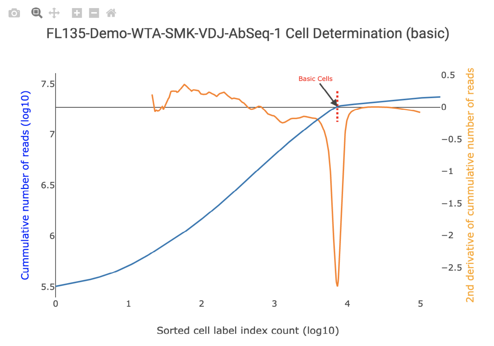
Bioproduct Cell Calling
By default, the Basic Cell Calling Algorithm is used for bioproducts. For the basic cell calling algorithm, the second derivative plot is shown on top of the cumulative read plot and the basic cell line is shown in red. Hovering over the graph will display a vertical line that corresponds to the number of putative cells on the cumulative read plot. All general graph functionality is available. See General Graph Functionality for details. For pipeline runs set to use the Refined Algorithm for mRNA and AbSeq, the number of false positive, false negative, and low molecule count cells are shown. All together, these show how the final refined cell call number was derived.
ATAC-Seq Cell Calling
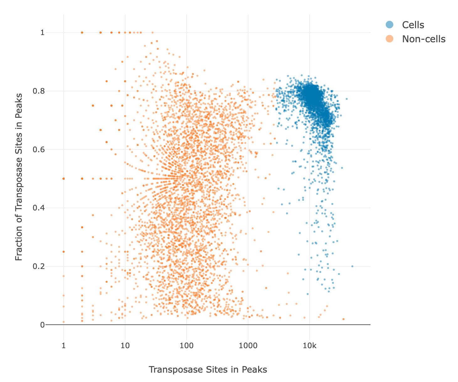
By default, the Basic Cell Calling Algorithm is used for ATAC-Seq. For the basic cell calling algorithm, the second derivative plot is shown on top of the cumulative transposase sites in peaks plot and the basic cell line is shown in red. All general graph functionality described in the Bioproduct Cell Calling section is available. For pipeline runs set to use the Refined Algorithm for ATAC-Seq, the putative cell and non-cell clusters from the Guassian Mixture Model (GMM) refined algorithm are shown on a scatter plot with the number of transposase sites in peaks on the x-axis and the fraction of transposase sites in peaks on the y-axis. See the Determine Putative Cells section for more details. The initial number of putative cells determined by the first and second GMMs using both the number of transposase sites in peaks and the fraction of transposase sites in peaks is shown along with the false positive and false negative cell labels determined by the final refitting step.
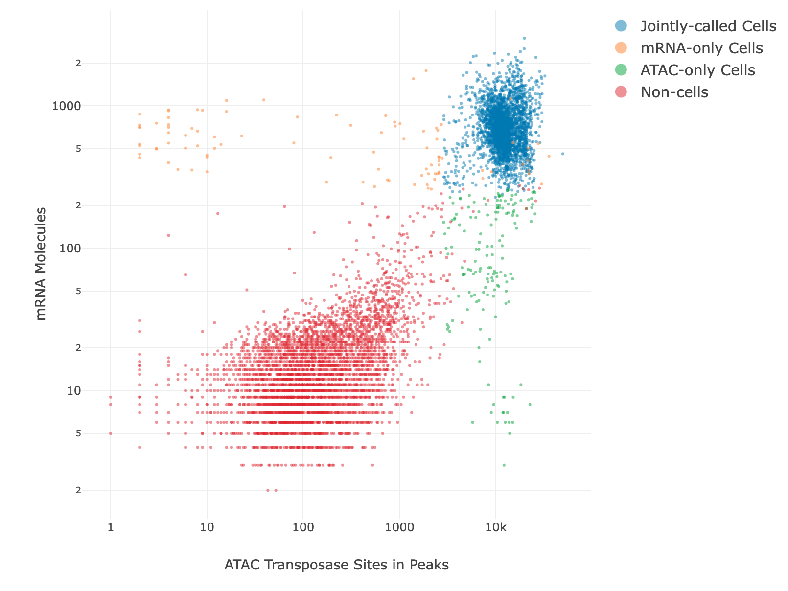
Joint mRNA and ATAC-Seq Cell Calling
By default, the basic cell calling algorithm is used for joint mRNA and ATAC-Seq cell calling. The user can select either the basic or refined algorithm for mRNA and ATAC-Seq separately. After the putative cells are called separately, the intersection of the two sets of cells make up the final putative cell count. There are 3 graphs available for joint mRNA and ATAC-Seq cell calling. For mRNA, the basic cell calling graph will be shown. For ATAC-Seq, either the basic or refined cell calling graph will be shown, depending on the algorithm selected. The joint cell calling plot shows the jointly called cells, the mRNA-only cells, the ATAC-only cells, and the non-cells on a scatter plot with the number of transposase sites in peaks on the x-axis and the number of mRNA UMIs on the y-axis. See the Determine Putative Cells section for more details. The number of jointly called cells along with the number of cells detected by each algorithm separately are reported.
Sample Multiplexing
In the sample multiplexing section, there is summary information such as the number of filtered reads that aligned to the sample tags and the percentage of sample tag reads that are assigned to putative cells. There is also a detailed section showing the number of reads and percentage of reads assigned to each sample tag, along with the number of cells, percentage of cells, number of reads per cell, and mean reads per cell for each sample tag. The detailed section also shows the number of multiplets and undetermined cells.
VDJ
In the VDJ section, the first table for the “Reads” and the second table for the “Molecules and Dominant Contigs” show the collapsed summary information for the Chain Category (BCR/TCR). By pressing the down arrow, the table expands to show more details about the specific chains. There is also a section for Cell Type specific metrics. There are four tables that can be selected from the dropdown menu: Paired Chains Pct, Pct Cells Positive, Pct Cells Full Length, and Mean Molecules per Cell.
ATAC-Seq
Fragment Length Distribution Plot
In the ATAC-Seq Fragments section, the fragment length distribution plot is shown. Chromatin of healthy cells is organized into nucleosomes by wrapping DNA around histone proteins. DNA within a nucleosome is not accessible to Tn5 transposase, so the genomic fragments of ATAC-Seq experiments tend to have a characteristic multi-peaked length distribution. The fragment lengths in the valleys of the distribution correspond to lengths of DNA necessary to be involved in one or more nucleosomes. Fragments below 147 bp in length are classified by Rhapsody as being in a Nucleosome-Free Region (NFR). Fragments of length between 147 and 294 bp are classified as mononucleosomal length. Lacking the characteristic NFR, mononucleosomal, and dinucleosomal peaks in the Fragment Length Distribution Plot is often an indicator of a low-quality ATAC-Seq experiment, because it suggests the genomic DNA is not organized in nucleosomes (often because of dead/dying cells or ineffective handling of sample nuclei).
TSS Enrichment Plot
In the ATAC-Seq Peaks section, the TSS enrichment plot is shown. Transcription Start Site (TSS) enrichment is calculated by aggregating the amount of Tn5 activity in the regions around every annotated TSS in the genome. For each TSS region (defined here as the annotated TSS, the 2000 bp upstream of the TSS, and the 2000 bp downstream of the TSS), all the Tn5 sites within the region are identified, along with their distance from the TSS. The total count of Tn5 sites at each distance within the TSS regions are added up, and then the values are normalized by dividing by the background rate of Tn5 activity (defined here as the average number of transposase sites in the first and last 100bp of the 4001 bp TSS region). The TSS Enrichment Score for an experiment is defined as the peak value of the TSS Enrichment Plot.
Metric Alerts
The Metric Alerts section provides information about metrics from the experiment that are above or below certain thresholds that are typical for most experiments. The alert will specify the library or bioproduct, metric, metric value, threshold, and some possible causes and suggestions.
General Graph Functionality
There are several ways to interact with the graphs. The toolbar provides the following functionality (from left to right):
| Graph function | Description |
|---|---|
| Download Plot | Allows you to download the plot in SVG format. Once downloaded, the SVG is a static image. |
| Zoom | Allows you to create a box which will zoom in to show the selected region in the graph area. |
| Pan | Allows you to move the graph to center on a different part of the graph to observe it clearer. |
| + | Zooms in 1 level around the center of the graph. |
| − | Zooms out 1 level around the center of the graph. |
| Home | Resets graph to original zoom and axes. |
Additional graph features:
- Color bar: The color bar on the right side of the Single Bioproduct Expression and Total Molecules per cell (mRNA and AbSeq) and Total Transposase Sites in Peaks per cell (ATAC) tSNE/UMAP plots show the intensity of log 10 based expression or counts.
- Hover: Hovering over the points on the graphs will give extra information (for example: cell index, expression level, or counts).